How to Add a Regression Line in Python Using Matplotlib

As a data scientist or software engineer, you may often find yourself working with data visualizations in Python. One common visualization technique is to plot data points on a scatter plot and then add a regression line to show the relationship between the variables. In this blog post, we will discuss how to add a regression line in Python using Matplotlib.
What is Matplotlib?
Matplotlib is a powerful data visualization library in Python. It provides a flexible platform for creating various plots and graphs. One such potential use case is plotting a scatterplot with a regression line, which can help data scientists and software engineers identify trends in their data. This article will guide you on how to accomplish this task using Matplotlib.
What is a Regression Line?
A regression line is a straight line that best fits the data points on a scatter plot. It is used to show the relationship between two variables and to make predictions about future values. The equation for a regression line is y = mx + b, where y is the dependent variable, x is the independent variable, m is the slope of the line, and b is the y-intercept.
Creating a Scatterplot with a Regression Line Using Matplotlib
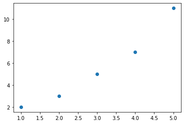
Firstly, you need to import Matplotlib. For the sake of demonstration, let’s presume we have a data set that we want to plot, and we hope to add a regression line to it:
import matplotlib.pyplot as plt
import numpy as np

# assuming x and y are the arrays that contain your data
x = np.array([1, 2, 3, 4, 5])
y = np.array([2, 3, 5, 7, 11])

# creating a scatter plot
plt.scatter(x, y)

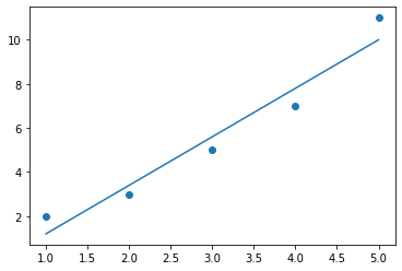
To add the regression line, we can use the numpy.polyfit() function, which fits a polynomial of a specified degree to a set of data using the method of least squares, and returns the polynomial coefficients [^8^]. In our case, we want to fit a linear regression line, so we will use a polynomial of degree 1:
# fitting a linear regression line
m, b = np.polyfit(x, y, 1)

# adding the regression line to the scatter plot
plt.plot(x, m*x + b)

In the code above, m represents the slope of the line and b is the y-intercept. By plotting the line m*x + b, we are adding the regression line to our scatterplot.
You can further customize your plot with additional Matplotlib features, such as setting labels for the x and y axes, creating a title, or adjusting the figure size.
Seaborn Alternative
If you’re looking to create more aesthetically pleasing plots or want a more convenient method, consider using the Seaborn library. With the seaborn.regplot() function, you can create a scatterplot with a regression line in a single line of code. Seaborn also provides other handy features for regression fits.
Conclusion
Incorporating a regression line into your scatterplots is a simple yet powerful way to understand the relationship between two variables. Whether you use Matplotlib or Seaborn, Python makes it easy to create these plots and gain valuable insights from your data.
About Saturn Cloud
Saturn Cloud is a portable AI platform that installs securely in any cloud account. Build, deploy, scale and collaborate on AI/ML workloads-no long term contracts, no vendor lock-in.
Saturn Cloud provides customizable, ready-to-use cloud environments
for collaborative data teams.
Try Saturn Cloud and join thousands of users moving to the cloud without having to switch tools.


