Creating Subplots in For Loop with Matplotlib: A Guide

Matplotlib is a powerful Python library for data visualization, offering a wide range of plotting capabilities. One of its most useful features is the ability to create subplots, which are smaller plots that can be organized within a larger figure. This post will guide you through the process of creating subplots in a for loop with Matplotlib, a technique that can greatly enhance your data visualization workflow.
Table of Contents
- What are Subplots?
- Setting Up Your Environment
- Creating Subplots in a For Loop
- Customizing Your Subplots
- Common Errors and Solutions
- Conclusion
What are Subplots?
Subplots are individual plots that can be placed within a larger figure. They are useful when you want to compare different datasets or visualize different aspects of the same dataset. With Matplotlib, you can create subplots in a for loop, which allows you to automate the process of creating multiple subplots.
Setting Up Your Environment
Before we start, make sure you have the necessary packages installed. If not, you can install them using pip:
pip install matplotlib numpy pandas
Creating Subplots in a For Loop
Let’s dive into the process of creating subplots in a for loop with Matplotlib. We’ll use a simple dataset for this example:
import numpy as np
import matplotlib.pyplot as plt

# Create a dataset
data = [np.random.randn(100) for _ in range(4)]
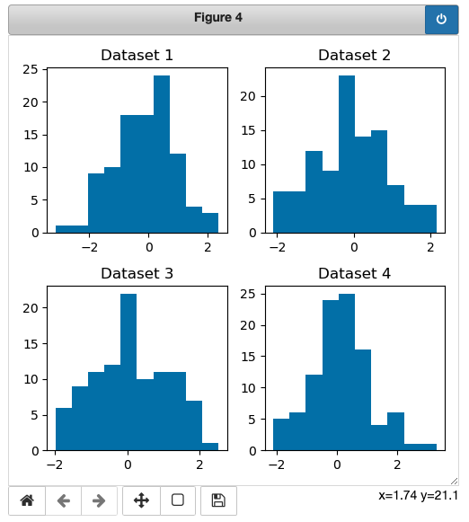
Now, let’s create a 2x2 grid of subplots using a for loop:
fig, axs = plt.subplots(2, 2, figsize=(5, 5))

for i, ax in enumerate(axs.flatten()):
    ax.hist(data[i])
    ax.set_title(f'Dataset {i+1}')

plt.tight_layout()
plt.show()
In this code, plt.subplots(2, 2, figsize=(5, 5)) creates a 2x2 grid of subplots. The enumerate(axs.flatten()) function is used to iterate over each subplot (or ‘axes’), and the ax.hist(data[i]) function is used to plot a histogram of the i-th dataset on the i-th subplot.

Customizing Your Subplots
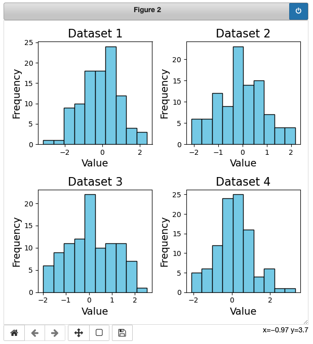
Matplotlib offers a wide range of customization options for your subplots. For example, you can adjust the size of your subplots, change their background color, or add labels to the x and y axes:
fig, axs = plt.subplots(2, 2, figsize=(6, 6))

for i, ax in enumerate(axs.flatten()):
    ax.hist(data[i], color='skyblue', edgecolor='black')
    ax.set_title(f'Dataset {i+1}', fontsize=16)
    ax.set_xlabel('Value', fontsize=14)
    ax.set_ylabel('Frequency', fontsize=14)

plt.tight_layout()
plt.show()
In this code, we’ve increased the size of the subplots, changed the color of the histograms, and added labels to the x and y axes.

Common Errors and Solutions
1. Index Errors in the For Loop:
- Error Description: If the length of your dataset (
datain this example) is not a multiple of the number of subplots you are trying to create, you might encounter index errors. - Solution: Ensure that the number of datasets in your list is compatible with the grid dimensions. If creating a 2x2 grid, as in the example, make sure you have exactly four datasets.
2. Incorrect Data Format:
- Error Description: Ensure that the data format is suitable for the chosen plot type. For instance, using non-numeric data for a histogram will result in errors.
- Solution: Double-check the data type and format. If using different plot types, ensure the data is compatible.
3. Inadequate Subplot Size:
- Error Description: Subplots may appear too small, making it challenging to interpret the visualizations.
- Solution: Adjust the
figsizeparameter inplt.subplots()to increase the overall size of the figure, providing more space for each subplot.
Conclusion
Creating subplots in a for loop with Matplotlib is a powerful technique that can greatly enhance your data visualization workflow. It allows you to automate the process of creating multiple subplots, making it easier to compare different datasets or visualize different aspects of the same dataset. With the wide range of customization options offered by Matplotlib, you can create subplots that are tailored to your specific needs.
Remember, effective data visualization is not just about presenting data; it’s about telling a story. By using subplots in a for loop with Matplotlib, you can tell a more compelling story with your data.
About Saturn Cloud
Saturn Cloud is a portable AI platform that installs securely in any cloud account. Build, deploy, scale and collaborate on AI/ML workloads-no long term contracts, no vendor lock-in.
Saturn Cloud provides customizable, ready-to-use cloud environments
for collaborative data teams.
Try Saturn Cloud and join thousands of users moving to the cloud without having to switch tools.


